Gunbroker Templates
I had the opportunity to work on their GunBroker account, where I developed several new templates for future use. These templates were created for both the item description pages and the additional terms of sale. The updated templates were incorporated into the revised listing format and used to expand upon the existing terms of sale.
Problem Statement
I was allowed to work on GunBroker’s brand-new template within their existing account. The original layout was very minimal and relied heavily on a black-and-white color scheme, which made the pages feel flat and visually unengaging. While the structure was functional, it lacked personality and did not fully reflect the brand’s presence or help listings stand out in a competitive marketplace.
The challenge was to introduce more visual style and hierarchy—without breaking GunBroker’s platform limitations or disrupting existing workflows. My goal was to enhance the overall look and feel of the template by adding thoughtful design elements, improving readability, and creating a more engaging experience, all while staying consistent with the brand and maintaining ease of use for both the company and its customers.
Old version template
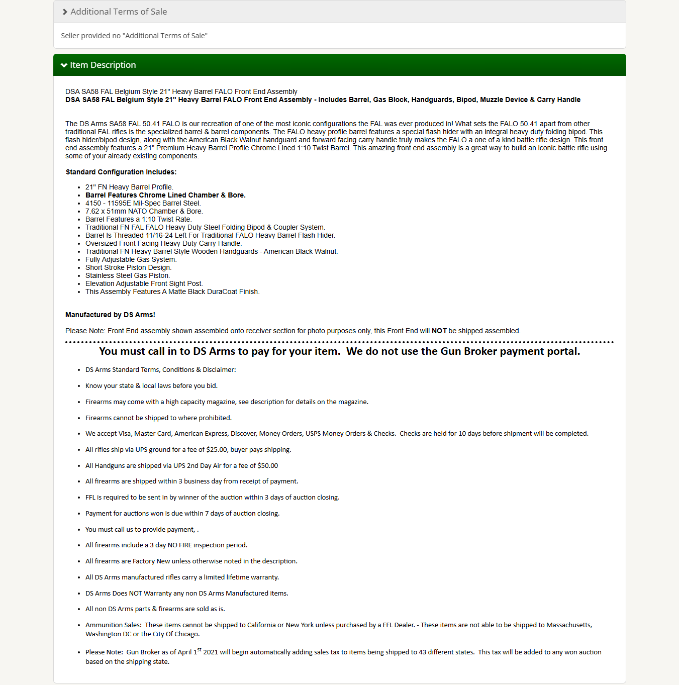
The older version of the template they were using was very minimal and lacked clear structure. Both the Item Description and the Additional Terms of Sale were combined into a single statement, which made it difficult for users to understand what information applied to the product versus the terms and conditions of the sale.
I was given a breakdown of the requirements and tasked with addressing both the Item Description and the Additional Terms of Sale within the same template. The goal was to clearly define and separate these two sections while keeping them in one place, so users could easily identify what they were reading and understand the difference between product details and sales terms.
This research phase focused on understanding how users scan listings, where confusion occurred in the older layout, and how clearer content hierarchy could improve readability and overall user experience.
Market Research
I conducted market research on different companies to understand how they structure and use their templates. This included reviewing competitor websites to analyze layout choices, content hierarchy, and how information is presented to users. The goal was to identify patterns that made more sense from a usability perspective and to understand how these design decisions could improve clarity, build trust, and ultimately help drive more sales for the company.
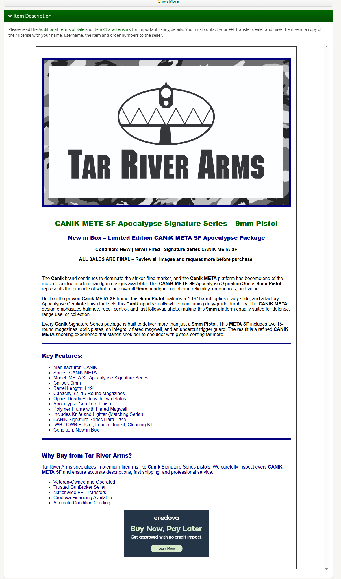
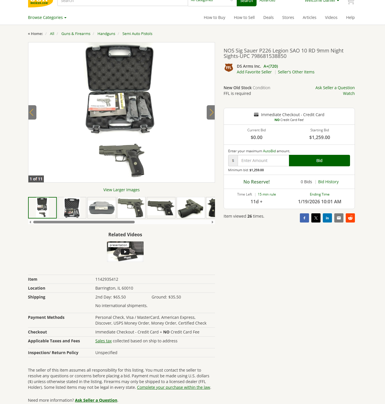
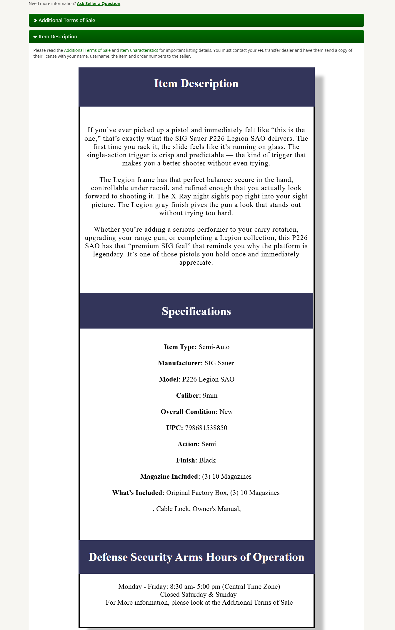
Item Description Template
I developed a simple template that anyone in the company can easily use, whether or not they need to make edits. The design was intentionally kept straightforward to ensure accessibility and ease of use across the team.
One of the key design choices was the use of blue in the template. This color was taken directly from the company’s older logo to maintain consistency with our established brand identity, ensuring that the template aligns with the company’s overall style and visual language.
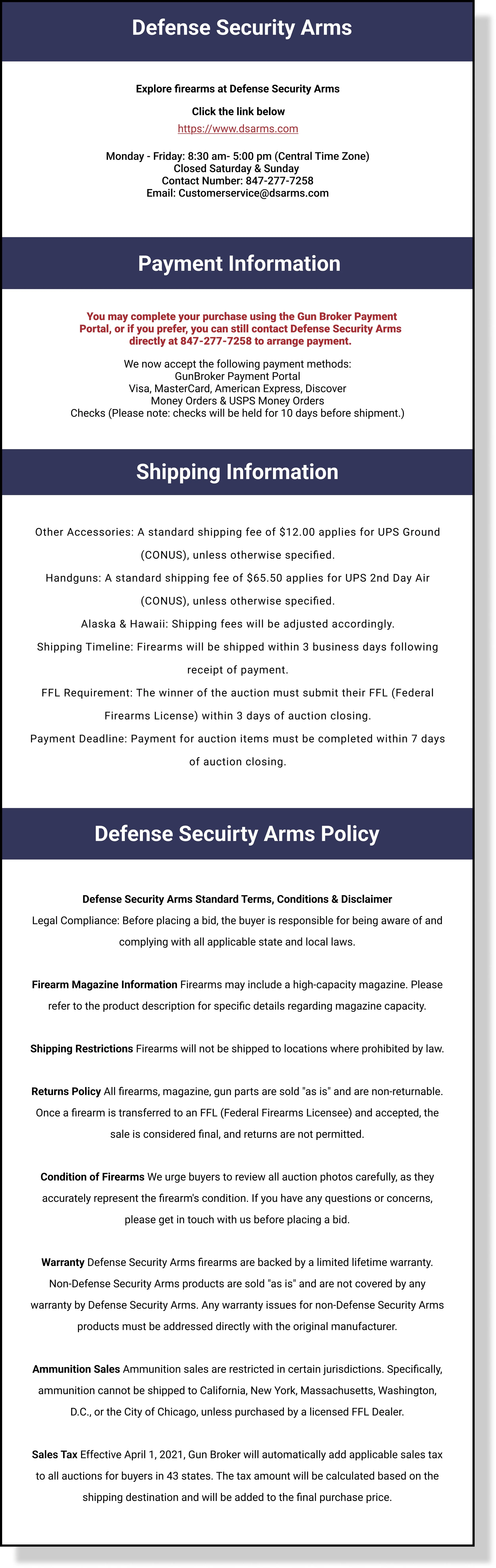
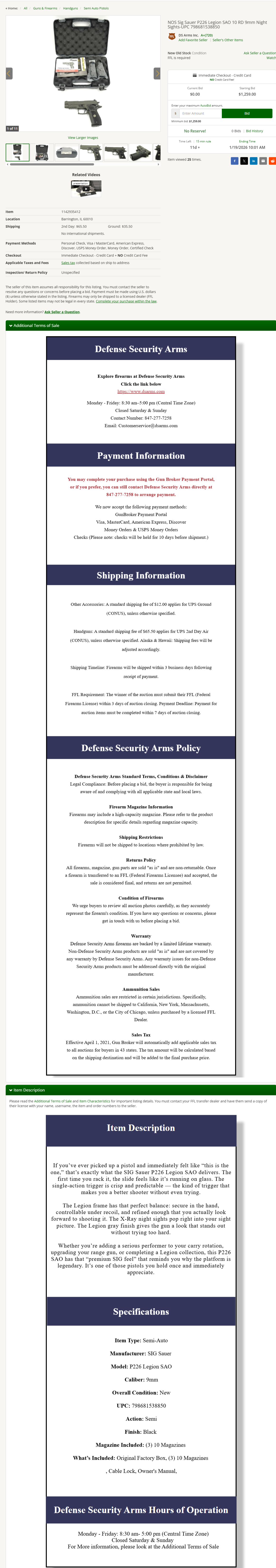
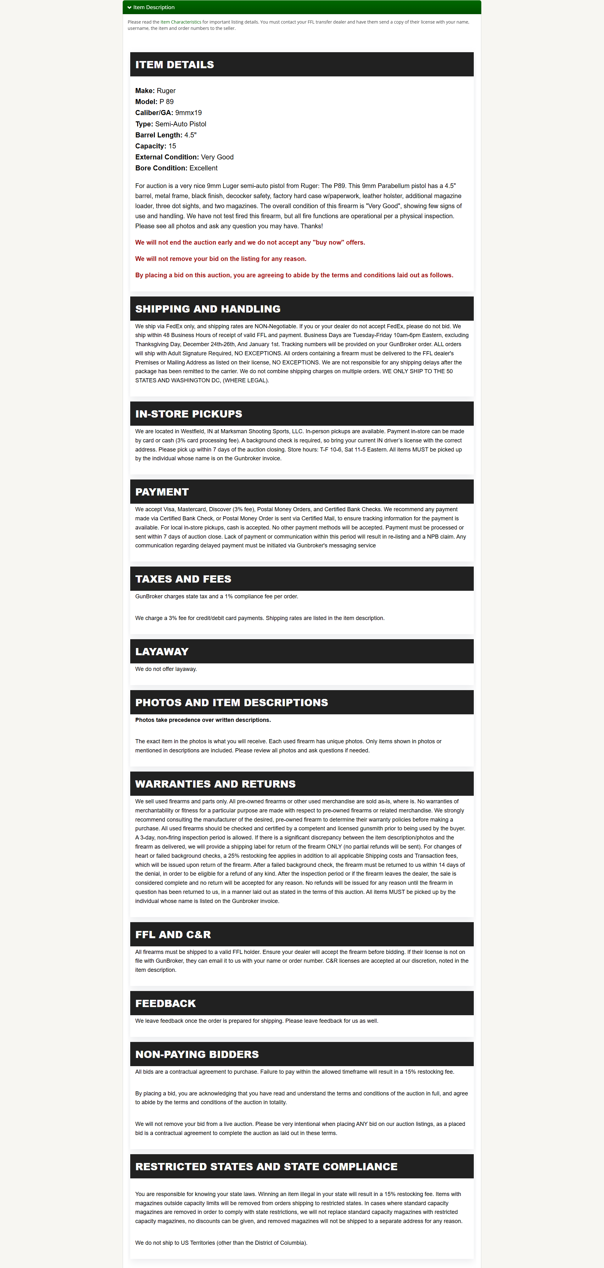
Additional Terms of Sale
Unlike the Item Description, the Additional Terms of Sale section had no existing structure, so I built this template entirely from scratch. The design is completely separate from the Item Description, emphasizing clarity and organization so users can quickly distinguish the terms of sale. While it stands on its own, I incorporated the same blue from the older logo to subtly connect it to the overall brand identity, ensuring visual consistency without mirroring the Item Description layout. This approach provides a professional and functional solution that clearly communicates important information to customers while remaining easy for team members to update or edit.
By creating two distinct templates, the company now has a streamlined, visually cohesive system that separates product details from sales terms while staying aligned with its brand identity. This solution improves usability for both employees and customers, reduces confusion, and enhances the overall presentation of listings.
Solution
To address the challenges in the existing template, I developed two separate, user-friendly templates: one for the Item Description and one for the Additional Terms of Sale. Each was designed with clarity, accessibility, and brand consistency in mind, while keeping them functionally distinct.